

Google Still Cares About Mobile-First Indexing — Here’s Why You Should Too
- Since July 5 2024, Googlebot exclusively uses mobile crawling for 100% of websites — no exceptions.
- The March 2026 Core Update doubled down on mobile Core Web Vitals as a ranking signal.
- Your desktop rankings are now determined almost entirely by your mobile version’s content, links, and performance.
- The most damaging mistake isn’t a missing viewport tag — it’s mobile content that’s thinner than desktop.
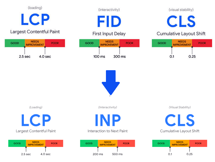
- If your mobile LCP is above 2.5 s, you’re leaving rankings on the table, right now.
Should You Even Care About This Right Now?
Act immediately if…
- Your mobile LCP is above 2.5 seconds in Search Console
- Your mobile page has less text/content than desktop
- You run a separate
m.example.comsubdomain - Your schema markup isn’t in the mobile HTML
- Traffic dropped after any 2025–2026 core update
Lower priority if…
- You’re on a responsive design with no hidden content
- Google Search Console shows no mobile usability errors
- Your mobile Core Web Vitals are all in the “Good” range
- Content, links, and metadata are identical on both versions
Mobile-first indexing is one of those topics that gets declared “done” every year — and then it keeps biting people. The rollout hit its final milestone in mid-2024. Google then reinforced it with the September 2025 “Perspective” core update and again with the March 2026 update. If you’ve been treating this as background noise, that’s exactly the problem.
What Actually Happened in 2024–2026
The story is cleaner than the coverage suggests. Google announced mobile-first indexing back in 2016 — a deliberate, multi-year migration. By 2019, all new sites defaulted to mobile crawling. The final piece fell into place on July 5, 2024: the last small set of holdout sites that Googlebot still visited with a desktop crawler were switched over. There are no longer any desktop-first exceptions in Google’s index.
“We’re embarking on our final last step of our migration to a mobile-first index for Google Search: the small set of sites we’ve still been crawling with desktop Googlebot will be crawled with mobile Googlebot after July 5, 2024.” — John Mueller, Search Advocate, Google Switzerland
What happened next is what most articles skip. Google didn’t stop there. The September 2025 “Perspective” core update explicitly reinforced mobile performance metrics as a ranking factor — not just a crawling preference. Sites with LCP above 2.5 seconds or high Cumulative Layout Shift scores on mobile saw measurable ranking drops. Then the March 2026 Core Update further tightened the connection between mobile Core Web Vitals, content parity, and overall search visibility.
How Googlebot Actually Sees Your Site Now
Here’s the mechanism that most explainers gloss over, and where real-world mistakes happen.
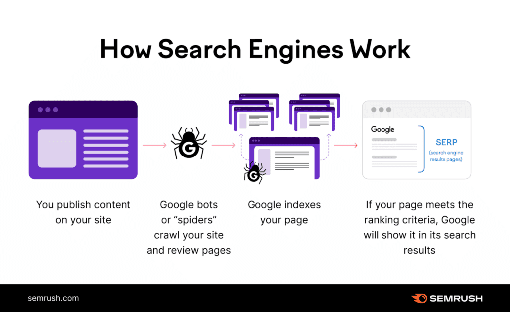
Googlebot Smartphone visits your URL using a mobile user agent. It renders the page — JavaScript and all — the way a mid-range Android device would. What it reads at that point is what gets indexed. Not what your desktop renders. Not what you can see on a MacBook. What the smartphone agent rendered.
This has three concrete consequences:
Consequence 1 — Content gap. If your mobile template collapses product descriptions, hides review text, or drops FAQ sections for “clean UX,” Google indexes the stripped version. Those keywords simply don’t exist in your index entry. You can have 2,000 words on desktop and rank as if you have 800.
Consequence 2 — Link equity gap. Internal links exist only if they’re in the rendered mobile HTML. A mega-menu that collapses to a hamburger button on mobile — and isn’t in the DOM until a user taps it — may not pass link equity to those pages at all, depending on how it’s built.
Consequence 3 — Schema gap. Structured data — your Product, FAQPage, Article, LocalBusiness schemas — must appear in the mobile HTML. If they’re loaded only on desktop via a conditional render, rich results disappear.
Core Web Vitals on Mobile: The Numbers That Matter
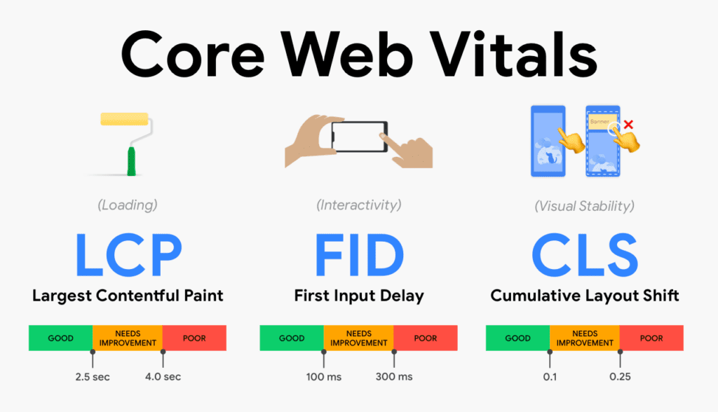
Core Web Vitals are Google’s primary performance ranking signal, and they’re measured from real user data — specifically from Chrome users on mobile devices. Lab scores from PageSpeed Insights or Lighthouse matter less than what the Chrome User Experience Report (CrUX) captures from actual visitors on actual networks.
The practical reality: your mobile scores almost always look worse than your desktop scores. Mobile devices have slower processors, constrained memory, and variable network conditions. A site that scores “Good” on desktop LCP can easily score “Needs Improvement” or “Poor” on mobile. And because mobile is what Google measures, that gap directly affects rankings — including for people searching on desktop.
INP replaced FID as a Core Web Vital in March 2024. It measures responsiveness — how quickly the browser visually responds after a user taps a button or interacts with the page. On mobile, where JavaScript execution is slower and touch latency exists, sites that load fast but respond sluggishly to interaction often fail INP without realizing it. Many older CMS themes and JavaScript-heavy page builders are particularly prone to this.
What Most SEOs Still Get Wrong
The common advice — “make sure your site is mobile-friendly, use responsive design, check your viewport tag” — is necessary but nowhere near sufficient. Here’s what causes actual ranking losses in 2026.
1. Content hidden via JavaScript on mobile
Content inside JavaScript-driven accordions, tabs, and “show more” elements is technically indexable. Google can execute JavaScript. But there’s a nuance: Google has explicitly stated that content hidden by default on mobile may receive slightly lower indexing weight in some contexts, and more importantly, if the JavaScript responsible for expanding that content doesn’t execute cleanly on the mobile crawler, the content simply isn’t seen. Always verify using the URL Inspection tool’s “Test Live URL” feature in Search Console to see exactly what Googlebot rendered.
2. Robots.txt blocking mobile resources
A surprisingly common configuration error: robots.txt rules block CSS files, JavaScript bundles, or image paths — often added to “save crawl budget” on large sites. On a desktop-first crawl, this sometimes went unnoticed. Under mobile-first crawling, these blocked resources prevent Googlebot Smartphone from rendering your pages correctly, resulting in incomplete indexing. Google can’t see what it can’t render.
3. Separate mobile URLs with broken canonicals
Sites running m.example.com subdomains or separate mobile templates face a compounding risk. If canonical tags don’t correctly point mobile URLs to the desktop canonical (or vice versa), if the alternate annotations are missing, or if structured data and metadata differ between versions, Google may index the wrong version — or neither cleanly. Responsive design with a single URL eliminates this class of problem entirely.
4. Schema markup absent from mobile HTML
Product, FAQ, review, and breadcrumb schemas are often injected via server-side rendering conditionally — sometimes only on desktop to “reduce mobile payload.” The result: rich results disappear from mobile SERPs, and the structured data signals that reinforce E-E-A-T are absent from the indexed version of the page.
Decision Framework: Where Your Site Actually Stands
| Site configuration | Risk level | Priority action |
|---|---|---|
| Responsive design, single URL, same content on all screen sizes | Low | Audit Core Web Vitals on mobile, verify schema in mobile HTML |
| Responsive but mobile hides content (accordions, tabs, truncated descriptions) | Medium | URL Inspection test → compare rendered HTML vs desktop source |
| Separate m.subdomain or dynamic serving | High | Canonical audit + content parity check + consider migration to responsive |
| JavaScript-heavy SPA with lazy-loaded content | High | Render test with mobile user agent → check indexed content via site: operator |
| Mobile LCP > 2.5 s in field data (CrUX) | High | PageSpeed Insights → identify LCP element → image or server-side fix |
| Schema markup present on desktop, absent or partial on mobile | Medium | Rich Results Test using mobile crawler → fix template-level schema injection |
The Audit Workflow — How This Actually Works Together
This is a sequential process. Don’t jump to fixes before completing the diagnosis. Many teams spend days optimizing LCP when their real problem is content parity — the rankings won’t move until the indexed content reflects the full page.
Step-by-step workflow- Confirm your indexing status Open Google Search Console → Settings → Google indexing → verify “Mobile Googlebot” is the listed crawler. If it still shows desktop, something is misconfigured at the server level.
- Run URL Inspection on your highest-value pages Use “Test Live URL” → select “More Info” → review the rendered HTML. Copy it. Compare it line-by-line with the desktop page source. Flag any content, links, or schema that appears in desktop but not in the mobile render.
- Crawl with a mobile user agent Screaming Frog → Spider mode → User Agent → set to “Googlebot Smartphone.” This reveals robots.txt blocking, noindex tags, and redirect chains that only affect mobile. Export and cross-reference against your desktop crawl.
- Audit Core Web Vitals from field data PageSpeed Insights → paste URL → scroll to “Field Data” section. This pulls real CrUX data from actual mobile users. Lab data (Lighthouse score) can be misleading. Fix LCP first — it’s the metric most commonly responsible for ranking drag.
- Verify structured data on mobile Rich Results Test (Google) → enter URL → select “Fetch as Mobile.” Review which schema types are detected. Run the same test in desktop mode. Any schema present on desktop but absent on mobile needs to be moved into the base HTML template.
- Fix and re-validate Use URL Inspection’s “Request Indexing” after fixes. Monitor Core Web Vitals in Search Console’s Core Web Vitals report (mobile tab) over 28-day rolling windows — CrUX data updates slowly, so don’t expect instant movement.
80% Solution Stack
You don’t need a specialist agency or enterprise tooling to get this right. Most teams can cover 80% of mobile-first indexing risk with four free or near-free tools.
For teams managing 1,000+ URLs or multiple domains, enterprise crawl platforms like Sitebulb, Lumar (formerly DeepCrawl), or Semrush’s site audit can run continuous mobile-vs-desktop parity comparisons at scale. But for most sites, the stack above is genuinely sufficient.
Real Limitations — What Mobile-First Indexing Doesn’t Fix
Here’s what the “just be mobile-friendly” narrative leaves out.
Content quality still matters more than mobile performance. A fast, perfectly indexed mobile page with thin or unhelpful content still won’t rank. Mobile-first indexing is the floor, not the ceiling. Google’s Helpful Content guidance and the E-E-A-T framework are applied to whatever content Googlebot indexes — including the mobile version. Speed is not a substitute for substance.
CrUX data requires traffic to exist. Core Web Vitals field data is drawn from real Chrome users. New pages, low-traffic pages, or sites with small audiences may not have enough CrUX data to generate field scores. In those cases, Google falls back to lab data — which can misrepresent real-world mobile performance. Sites in this situation should prioritize lab score improvements while building audience.
Mobile-first doesn’t eliminate desktop signals entirely. Google still crawls desktop pages as part of its broader quality assessment. Desktop performance matters for ranking on desktop queries, and desktop UX signals still factor into overall quality evaluation. Mobile-first means mobile is primary, not exclusive. The goal is parity, not abandonment of desktop.
Responsive design isn’t automatically content-parity safe. Responsive design eliminates the m.subdomain problem, but it doesn’t prevent a developer from conditionally rendering components based on screen width. Many “fully responsive” sites have JavaScript conditions that display different content on different breakpoints — and those conditions can hide content from Googlebot even on a responsive setup.
FAQ
<details> and <summary> elements for collapsible content rather than JavaScript toggles. They’re in the initial HTML, always indexable, and need no JavaScript to function.Final Thoughts — The Uncomfortable Truth
Mobile-first indexing has been “fully rolled out” for nearly two years now. And yet, in many workflows, the audit described in this piece has never been run. Teams check mobile usability in Search Console, see no errors flagged, and consider it done. That’s not done — that’s checked a box.
The real risk is invisible: content that renders correctly visually on mobile but that Googlebot’s smartphone crawler doesn’t fully see. Structured data that’s technically present on your desktop but absent from the indexed version. Internal links that live behind JavaScript-driven navigation that the mobile crawler never resolves. None of these show up as “errors” in Search Console. They show up as flat or declining rankings for no obvious reason.
The trade-off worth acknowledging: mobile optimization has a ceiling. You can have perfect Core Web Vitals, complete content parity, and clean structured data — and still lose rankings to a competitor with better content, more authoritative backlinks, or stronger E-E-A-T signals. Mobile-first indexing is a necessary condition for competitive rankings in 2026, not a sufficient one.
The hard decision most teams avoid: going back through your highest-value pages and manually verifying — using Googlebot Smartphone rendering, not your own browser — that what you want indexed is actually what’s there. It takes time. It’s not glamorous. It’s usually where the real ranking levers are hiding.
Primary sources
- Google Search Central: Mobile-first indexing best practices — Official documentation, updated December 2025
- Google web.dev: Core Web Vitals — LCP, INP, CLS thresholds and measurement methodology
- John Mueller, Google Search Advocate — Statement on July 2024 final migration (via Google Search Central blog)
Secondary sources
- Core Web Vitals 2026 — Ideafueled — CrUX mobile traffic data (Q3 2025 figures)
- Google’s Mobile-First Indexing Final Rollout Impact — WiseRank — March 2026 Core Update analysis
- Mobile-First Indexing Best Practices — Proven ROI — Internal benchmark data from 120+ remediation projects
Related Articles
AI Agent Use Cases by Business Function:The 2026 Prioritization Guide
The Only Guide to AI Productivity Tools You Need in 2026
AI for Marketers & Creators The 2026 Reality Check
Personal AI Agents: Your Digital Self, Finally Unleashed
Contact Us
Speed & Performance Tests: The Definitive 2025–2026 Guide
Radiology AI in Production: Distribution Shift, Bias, and Why Benchmarks Don’t Tell the Full Story
Best PKM Tools: The Complete Ranked List